

Start with the surface, not the shade
Ink colour is best chosen after looking at the surface, the light around it, and how the pack or part will move through the job. A pale carton, for example, usually takes a dark ink well, while black plastic, painted steel or dark timber often needs a lighter mark to stand out cleanly.
On a wet or slightly dusty line, the cleaner contrast often wins over the fanciest-looking colour. A mark that can be read by a picker, driver or warehouse clerk is worth more than one that only looks good on the test piece. That is especially true when cartons are stacked in a Pinetown warehouse or loaded for transport through humid coastal air.
Handheld inkjet coders can handle different ink types, but the print still needs the right contrast for the substrate. A good colour match is not about making the code decorative, it is about making the detail visible at arm’s length and under working light.
Light surfaces usually need darker contrast
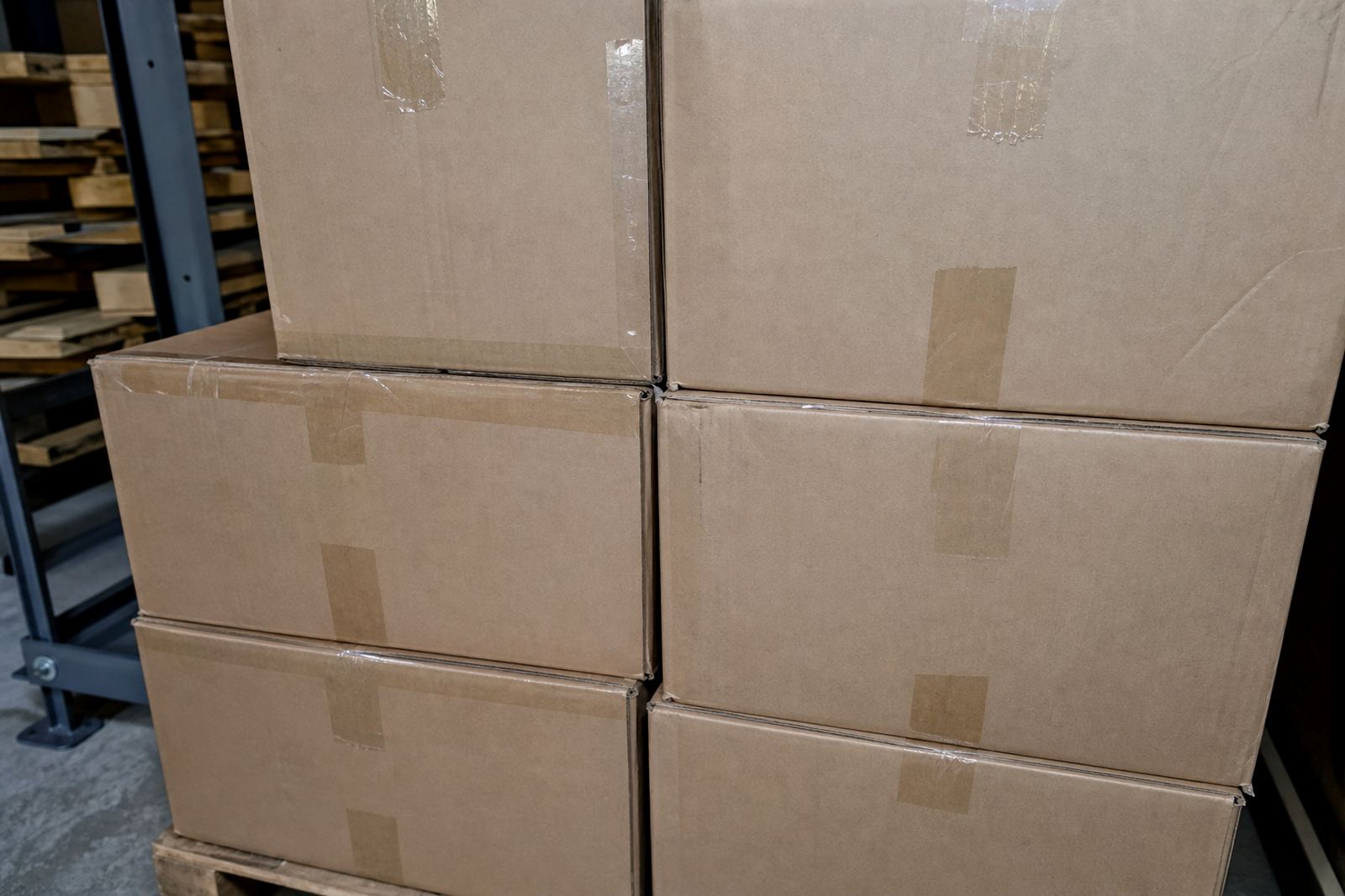
Most white or kraft cartons, pale bags and untreated timber accept dark ink well. Black ink is the usual starting point for dates, batch numbers and small logos because it gives strong contrast and holds up through sorting, palletising and transit.
When the print height is small, contrast matters even more. A 12 mm or 14 mm code on a carton can still be easy to read if the ink sits sharply on the surface. On rough timber, the line may spread a little into the grain, so a darker ink and a clear message layout help keep the code readable.
- White cartons: black or deep blue for strong visibility
- Natural timber: black, dark blue or dark green depending on grain and finish
- Light bags: dark ink that does not sink into the weave too much
- Uncoated board: darker shades with a quick-dry option if handling is fast
Where a logo is part of the mark, dark ink gives the cleanest outline on pale packs. Fine lines and small text need a bit more care than a simple date stamp, so test printing matters before the job starts.
Dark surfaces call for lighter inks
Black plastic crates, dark-painted pipes, coated steel and dark timber often need a lighter ink if the mark must be read quickly. White, yellow and sometimes pale blue inks are used when the goal is visible contrast against a dark base.
Not every light ink performs the same way. Some need a smoother surface, while others are better when the material is slightly rough or handled soon after marking. Quick-dry ink helps where pipes, steel or timber are moved straight after coding, and that matters on active yards in Durban and Johannesburg where parts do not wait around.
Solvent-based inks are often used on less porous surfaces, while water-based options can suit absorbent cartons and boards. The right choice depends on the surface finish, not just the colour itself. If the ink beads up or fades into the surface, the code loses its value very quickly.
Barcodes need colour that the scanner can live with
Barcode setup is more exact than a simple date or batch code. The scanner needs clear bars and clean gaps, so the ink has to sit with enough density to be read properly. Dark bars on a pale background are usually the safest route, and that is why black remains the common choice for cartons and labels alike.
For cartons with logos and barcodes on the same face, keep the barcode colour the strongest element on the panel. If the logo sits too close or uses a similar shade, the scan can become awkward. A clean layout with a separate print zone makes day-to-day handling easier for staff and drivers.
- Use the highest contrast available for the barcode area
- Leave space around the bars so the scanner sees the full code
- Keep logos away from the barcode quiet zone
- Test the code on the actual pack, not only on a sample sheet
Barcode work is one of those jobs where a neat looking print is not enough. The scan must work on the packed item, under warehouse light, and after the carton has been moved a few times.
Humidity, dust and handling change the colour choice
In coastal areas such as Durban and Richards Bay, humidity can affect how ink settles on some surfaces. In drier inland yards, dust and abrasion can become the bigger issue. That is why colour choice and ink type should be considered together rather than as separate decisions.
A quick-dry ink can be useful where cartons are closed and stacked soon after marking. On timber, the grain can pull at the ink and soften the edges, so a darker shade with a firm print pattern often works better. On pipes or coated metal, adhesion matters more than looking glossy.
When a job moves across more than one site, a consistent colour helps the team read the codes the same way in every depot. A dark code on a light carton should look the same in Pinetown as it does in Cape Town, provided the surface and ink match properly.
How hire terms affect ink planning
Short weekly or longer monthly terms work best when the ink plan is settled early. A short hire for a repacking run may only need one colour and one surface type, while a longer hire can cover cartons, timber and pipes in the same period. That changes how much consumable stock is worth keeping with the unit.
For a mixed job, a practical set-up often includes the main print colour, a back-up ink type and a test pack of sample pieces. That gives room to adjust if the surface changes or the mark needs to be more visible than expected. Delivery and collection across South Africa also makes it useful to keep the ink plan simple and direct.
- Short hire: one main colour, one surface type, lean message setup
- Longer hire: room for more than one ink option
- Mixed packs: test on the palest and darkest surface first
- Moving sites: keep the same colour standard where possible
A clear colour plan reduces the stop-start feel of a job. It also helps when the same unit is used for dates on cartons in one week and pipe marking in the next.
A Durban example from the floor
A packing team in the Durban area may need to mark white cartons leaving on a weekly schedule, then shift to dark plastic drums or painted pipe offcuts later in the month. In that case, black ink would be the straightforward pick for the cartons, while a pale ink would be the more practical option for the darker items.
If the same handheld printer is used on timber for crate marking, the team may need a quick-dry formula with a slightly heavier print to stay legible over the grain. That is where setup help, message loading and test printing make the difference. A good result means choosing the right machine and matching the ink to the actual work piece.
For a mixed production yard, the best colour choice is the one that holds up under real handling, not only on a clean sample board. That is usually the standard that matters when cartons move through Westmead, New Germany or further afield to Johannesburg and Pietermaritzburg.