What print height really means on a handheld coder
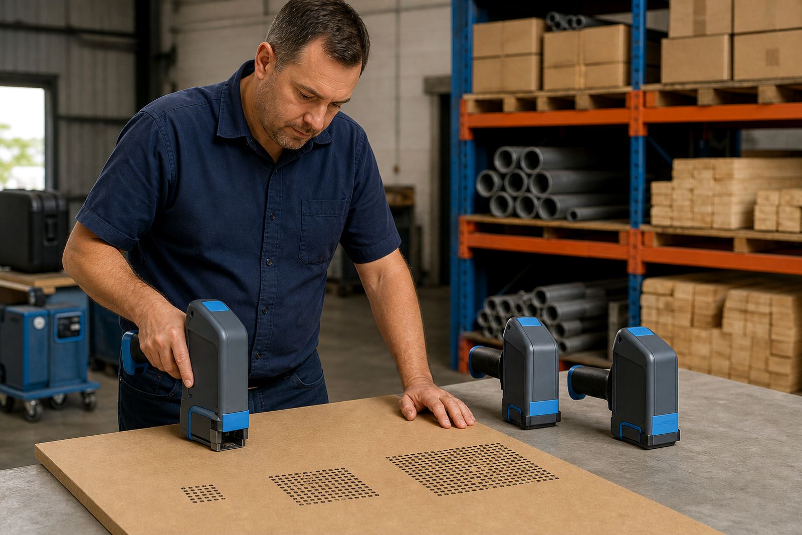
Print height is the vertical size of the characters or code that the printer lays down in one pass. On handheld inkjet printers, that height is measured in millimetres and it affects how much information fits on the surface, how easy the mark is to read, and how steady the hand needs to be during printing.
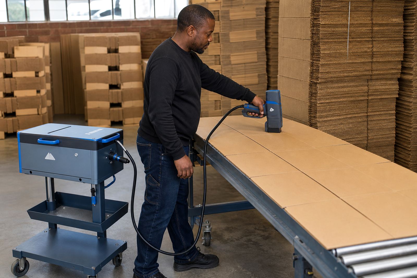
Small marks suit short expiry dates or simple batch codes on cartons. Taller print works better when the message needs more room, such as a longer product name, a multi-line code or a logo. If the height is pushed too far for the surface, letters can look stretched or uneven, which is a problem on wrapped cartons or curved pipe. A neat line at 10 mm can read better than a messy line at 18 mm.
- Short codes need less height and less space.
- Longer text needs more height or more than one line.
- Curved and rough surfaces usually need a safer, smaller height.
Matching character size to cartons, pipes and timber
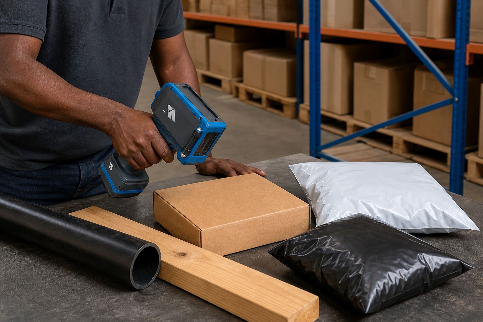
Different materials behave in different ways. Cartons take print cleanly, but corrugated board can pull ink into the fibres. Timber often has grain and small variations in colour, so larger characters may be easier to spot from a distance. Pipes and steel can carry sharper marks, yet their shape means the print height has to stay readable as the operator moves the coder along the surface.
For warehouse work in Durban or Pinetown, a common setup is a medium height for batch numbers and dates on outer cartons. On timber, a taller line may suit pack labels, while steel sections often need a tighter setting with strong contrast. In Richards Bay, where moisture can sit in the air, quick-dry ink and a sensible print height help keep the message clean before rubbing or handling starts.
- Cartons: clean, medium height often works well.
- Pipes: keep the line controlled so the curve does not break letters apart.
- Timber: allow for grain, knots and colour changes.
- Steel: use enough contrast and a height that stays steady during movement.
When barcodes need more care than plain text
Barcodes are less forgiving than plain text. The bars must stay sharp, evenly spaced and printed at the correct height for scanning. If the character size is too small, the code may still print, but scanning can become unreliable. If it is too large for the space available, the bars can crowd into nearby text or sit too close to an edge.
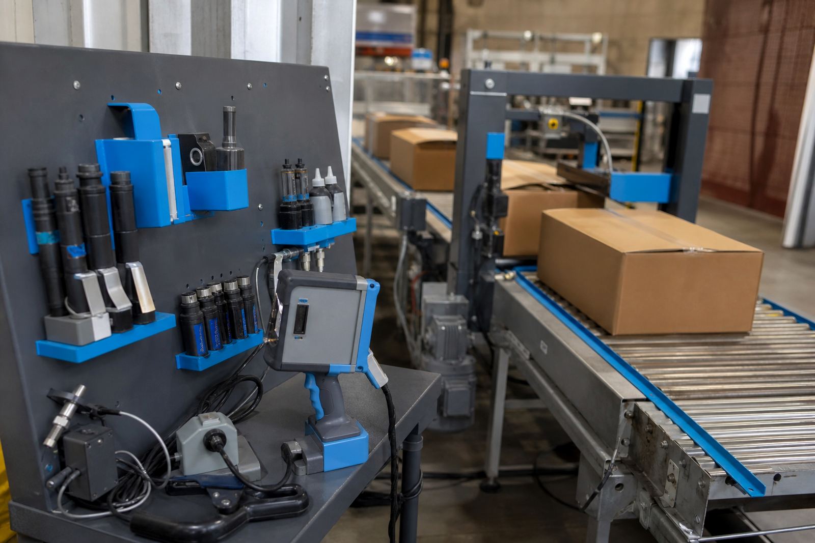
When a handheld unit is set up for barcode work, the message length, print height and print speed all have to fit together. A label on a carton might need both a barcode and a batch code, so the layout must leave enough room for each item. If the same surface also carries a logo, the logo height needs to be measured against the barcode zone so the whole mark stays legible.
- Leave clear space around the barcode.
- Keep text away from folds, seams and corners.
- Test the scan before loading a full batch.
Ink choice can change the way height looks
The ink matters just as much as the setting on the printer. Solvent ink tends to grip better on non-porous or tricky surfaces such as steel and some plastics. Water-based ink is often used on absorbent materials like cardboard and untreated timber. Quick-dry options help where the print will be handled soon after coding, which is useful on busy packing lines and in yards where items move quickly.
Ink flow can change the look of the letters at different heights. A taller setting may need a bit more care if the surface is absorbent, because the edges can spread slightly. On smoother stock, the same height can look crisp and sharp. That is why a test print is worth doing before hire work starts in earnest, especially when the job includes mixed materials in one consignment.
- Solvent ink suits tougher, less absorbent surfaces.
- Water-based ink suits cartons and timber.
- Quick-dry ink helps when handling happens soon after printing.
Reading distance, lighting and operator movement
Print height should match how the mark will be checked. A date code that will be read at arm’s length can stay smaller than a pallet mark that needs to be seen across a store room. Poor lighting, dusty floors and busy packing bays all make small text harder to check. In a Pinetown workshop, a line that looks fine under bright lights may need to be slightly larger once it moves to a yard or loading area.
Handheld printers also depend on the steadiness of the operator. If the print head moves too fast, tall characters can break up. If it moves too slowly, ink can gather and the line can look heavy. A practical setting keeps the motion comfortable and the code consistent. That is why operator training matters, even for teams that only need the unit on hire for a few weeks.
- Match the height to the distance where the mark will be checked.
- Use stable hand movement, not a rushed pass.
- Check the mark under the lighting it will live under.
A Durban hire job with mixed surfaces
Think of a Durban packing team sending cartons, timber packing pieces and a few steel brackets out the same day. The cartons may take a neat 12 mm date and batch line. The timber could need a slightly taller mark for quick reading in the yard. The steel brackets may need a tighter layout so the code stays sharp on the flatter section. One print height will not suit all three surfaces, and that is normal.
In hire work, the better route is usually to test a few heights before the full run starts. That gives the operator a clear reference and shows whether the ink, the surface and the message all work together. Once the right height is set, the message loading, barcode setup and logo setup can sit in place without extra fuss. It also makes weekly and monthly hire easier, because the team can keep the settings that suit the job instead of chasing a fresh adjustment every day.
- Test each surface before the main run.
- Keep one setting only where the materials are the same.
- Adjust height when the surface, code length or reading distance changes.
A plain way to judge the right height
The best print height is the one that stays readable after handling, stacking and transport. If the letters are clean, the barcode scans, and the logo sits where it should, the setting is probably doing its job. If the print looks crowded or fades into the surface, the height or ink choice needs another look.
At handheld-printers.co.za, the hire team works with setup help, operator training, test printing and consumables supply for sites in Pinetown, Durban, Pietermaritzburg, Johannesburg, Cape Town and Richards Bay. That matters because a height that works on one surface can fall flat on another, and the job is often won or lost in the first test mark, not the last.
- Readable after handling means the height is close to right.
- Barcode performance matters as much as appearance.
- One test print can save a full batch of poor marks.